WINERY
The Wine House
Mobile App Design

Logo

Project Banner
Project Overview:
Winery (The Wine House) is an online wine shop that enables wine lovers to get their favourite wines with just a few clicks. This app will act as a middle man between wine merchants and consumers. Users can search, select and purchase topnotch wines at the comfort of their homes or wherever, the app will take their order, process them and have the wines delivered to clients within a short period of time (Speculated Delivery Timeline).
Design Deliverables:
1.Mobile App to make purchase and deliveries of wines easy and seamless.
2.Simple and user centred design
3.Easy and functional navigation
4.Detailed information about any type of wine selected by the consumer
5.User Friendly Typography
6.Working Prototype
Tools:
Figma
Target Audience
This mobile app targets three categories of users:
1.The consumers: These are the people who are fond of wines. This set of people consume wines on a daily basis, but need a trustworthy and swift vendor to get their wines delivered to them when needed.
2.The Merchants: These are the people who sell the wines. Winery mobile app brings these people closer to their potential clients by acting as a middle man between them and the consumers.
3.The newbies: These are the people that only consume wines once in a blue moon. They most times need guidance, because they are not so into wines. Winery mobile app guides them by showing them all the various kinds of wines there are and basically all the information they need to know about the wine, e.g where it is made, the ingredients, the alcohol level, e.t.c.
User Flow

User flow Diagram
Screens And Features

CTA Screen
More Like The Introductory Screen.
This screen will pop up each time the app is opened.
Colors Used on screen:
RED- D80A0A, 30%, 35%, 100%.
OXBLOOD- 742E2E,40%
WHITE- FFFFF, 100%
Text Styles:
Overlock- Bold, Regular.

Onboarding For Returning Users.
Welcome or Log In Screen.
Colors Used:
Off White- FFFF6
Black- 00000. 100%, 50%
Non White- D6D6D6
Light Grey- D9D9D9
Red- D80A0A
Text Style:
Inter- ExtraBOLD, Regular,
Roboto Slab- Regular, Light, Medium

Onboarding For New Users
Colors Used:
Off White- FFFF6
Black- 00000. 100%, 50%
Non White- D6D6D6
Light Grey- D9D9D9
Red- D80A0A
Text Style:
Inter- ExtraBOLD, Regular,
Roboto Slab- Regular, Light, Medium

Home Screen / Menu Screen Or even Dashboard.
This is like the basic selection screen, where users can see different categories of wines; (White Wine, Red Wine, Champagne) By swiping right and left to reverse. There is a search bar that enable users to just fill in the name of whatever wine they want. This screen also have the major icons- The Home Icon, the Cart Icon and the Favourite Icon. At the top of the screen is the profile picture and name salutation, (For demographics and location updating). Tapping any of the wines on the menu will be directed to the detailed information of the wine.
Colors Used:
White- FFFFF 100%, 60%, 50%
Black- 000000 100%, 70%
Red- D80A0A 100%, 60%
Charcoal- 252525
Text Styles:
Roboto Slab- Light, Regular, Medium,

Wine Details
This is the screen that pops up after tapping any of the wine items on the Home screen/Menu screen.
This screen gives information of the selected wine; The name, quality (in star rating), where it is made, the ingredients, Price, and quantity.
From this screen, users may add the item to their cart, checkout or even go back to the previous screen.
Colours used:
White- FFFFF, 100%, 60%, 70%
Red- D80A0A
Black- 000000
Charcoal- 252525
Text Styles:
Roboto Slab- Semi Bold, Bold, Regular, Medium
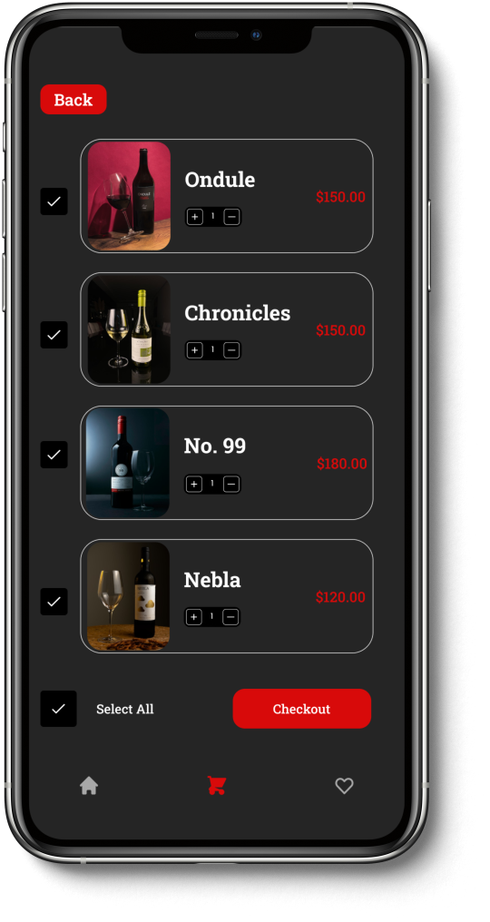
The Cart Screen
After selecting all items, knowing their details, users can now proceed to add them to cart for possible checkout. Here in the cart users can select and unselect any item they wish.
Colors used:
White- FFFFF, 100%, 60%
Light Grey- D9D9D9
Red- D80A0A
Black- 00000
Charcoal- 252525
Text Styles:
Roboto Slab- Semi Bold, Bold, Medium

The Payment Screen
After carefully searching, selecting and unselecting loved wines and tapping the checkout button, user will be directed to choose a payment method (one of either card payment, flutterwave, paypal or even cash on delivery) and also seeing the total amount to be paid.
Colours Used:
White- FFFFF
Red- D80A0A
Black- 00000
Charcoal- 252525
Text Styles:
Roboto Slab- Semi Bold, Regular.

Add Card Screen
At this point, the user have chosen a payment method (By card). User fills in the card information and proceeds to pay.
Colors Used:
White- FFFFFF
Black- 000000, 100%, 60%
Light Grey- D9D9D9
Red- D80A0A
Charcoal- 252525
Text Styles:
Roboto Slab- Semi Bold, Light, Regular, Medium.
Design System
COLOURS
COLOURS

Text styles

Components

Conclusion
This is just a simple uiux case study... Please view and feel free to make comments, suggestions and even corrections. For Jobs and engagements, Please reach out to me on all social media platforms.
Rachael Omotayo.

